
The Mercator projection is one of the most widely recognized and frequently used map projections, especially in Western education and media. Created in 1569 by the Flemish geographer and cartographer Gerardus Mercator, it was revolutionary for its time. The primary goal of Mercator’s projection was to assist maritime navigation by allowing sailors to plot straight-line courses. It succeeded magnificently in this purpose by preserving angles and directions, making it ideal for navigation. However, what the Mercator projection preserves in shape and direction, it significantly distorts in size—particularly as one moves away from the equator toward the poles.
For centuries, this distortion has affected how we perceive the world. Countries in the Global North, such as those in Europe and North America, appear disproportionately larger than those near the equator, such as African and South American nations. This visual bias has contributed to a skewed worldview that overemphasizes the importance of certain countries while underrepresenting others.
Understanding the Mechanics of the Mercator Projection
The Mercator projection is a cylindrical map projection. Imagine wrapping a cylinder around the globe so that it touches the equator, then projecting the Earth’s surface onto this cylinder. When the cylinder is unwrapped into a flat map, lines of latitude and longitude become straight and perpendicular, forming a rectangular grid. This allows for consistent angle measurements, which is invaluable for navigators using compass bearings.
However, as you move away from the equator, this projection begins to stretch landmasses vertically. This is because the scale of the map increases with latitude. While the equator remains true to scale, areas near the poles are vastly exaggerated. For instance, Greenland and Africa are often shown to be roughly the same size on a Mercator map, when in reality, Africa is about 14 times larger.
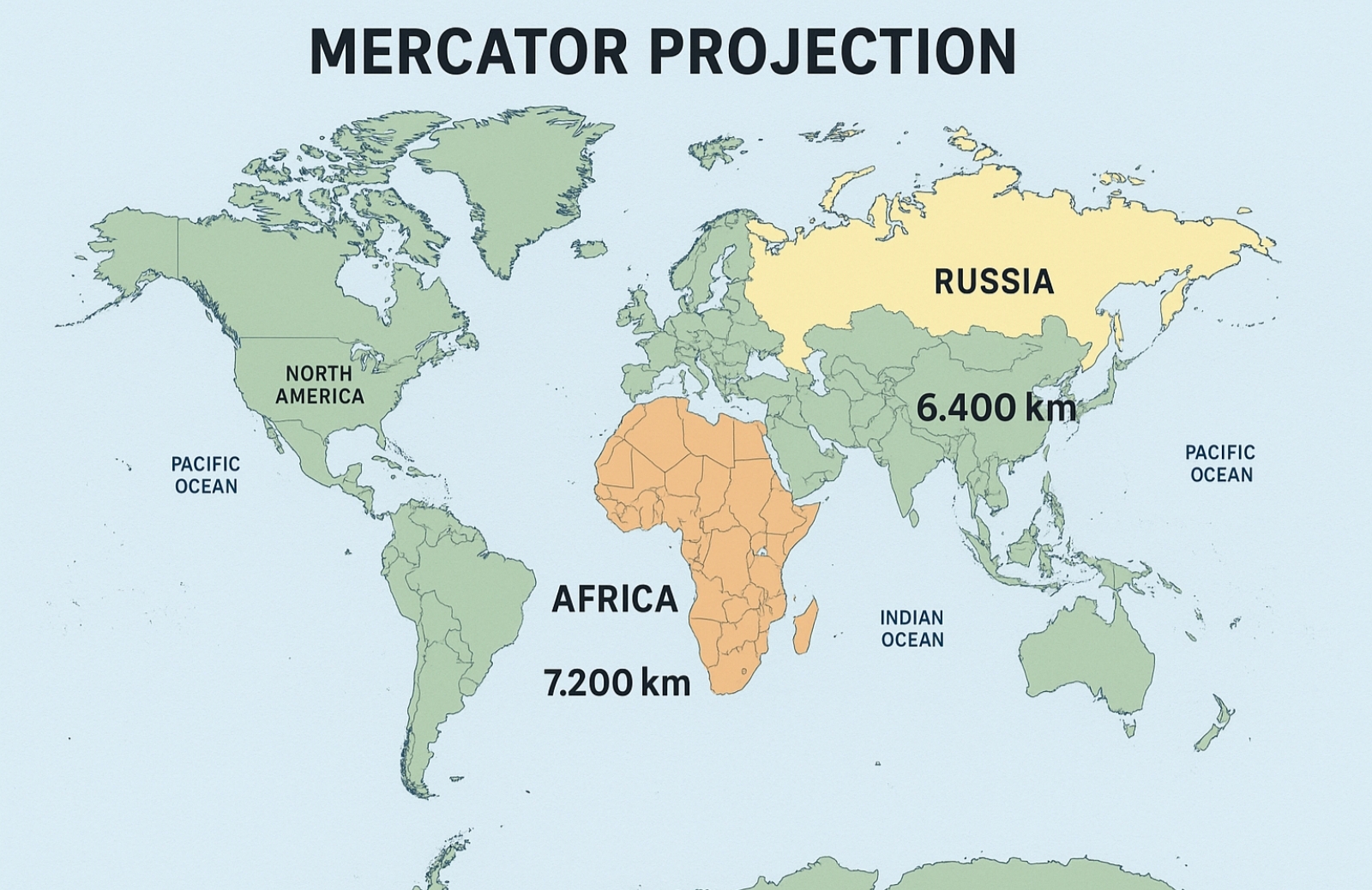
Visualizing the Distortion
To grasp the extent of the Mercator distortion, consider the following visual example. The map image below shows two horizontal lines:
- 6,400 km across Russia, positioned at higher northern latitudes.
- 7,200 km across Africa, located close to the equator.
Even though the African line is longer, the Mercator projection often portrays the Russian line as stretching across a seemingly vaster area. This is due to the increasing vertical scale as latitude increases.
Map illustrating Mercator distortion
Comparing Real Sizes: Africa vs. Russia
Let’s break down the actual geographical data to put the distortion in perspective:
- Africa: 30.37 million square kilometers
- Russia: 17.1 million square kilometers
Africa is nearly twice the size of Russia. It contains over 50 countries, diverse ecosystems, and more than 1.4 billion people. Despite this, the Mercator map makes it look smaller or equal in size to Russia—a country with less than half the land area and a significantly lower population.
Additionally, Greenland, which covers about 2.1 million square kilometers, often appears comparable in size to Africa on Mercator maps. This visual misrepresentation has long-lasting impacts on how regions are perceived in terms of importance, development, and influence.
Cultural and Political Implications
The choice of map projection is not just a technical decision—it has political, cultural, and psychological ramifications. The dominance of the Mercator projection in classrooms, atlases, and online platforms like Google Maps has reinforced a Eurocentric worldview. Larger-looking nations appear more dominant and significant, while smaller-appearing regions near the equator may be subconsciously viewed as less important.
Critics argue that this distortion has perpetuated colonial mindsets, contributing to the underappreciation of Africa, Latin America, and Southeast Asia. It’s not just about geography—it’s about visibility, prominence, and representation on a global scale.
Alternative Map Projections
To counteract these issues, cartographers have developed alternative projections that aim to preserve area rather than shape or direction. One of the most well-known alternatives is the Gall-Peters projection. Introduced in the 19th century and revived in the 20th, the Gall-Peters projection presents countries in true proportion to their actual areas. This means that Africa, South America, and other equatorial regions are shown in their correct size, which drastically alters the visual balance of the map.
Another projection worth mentioning is the Robinson projection, which offers a compromise by distorting shape, area, and direction minimally to create a more visually pleasing and balanced view of the Earth. It’s often used in educational contexts to provide a more accurate global perspective without sacrificing aesthetic coherence.
Modern Uses and Misuses
Despite its drawbacks, the Mercator projection remains in widespread use, especially in digital mapping services. This is mainly because it maintains straight lines for constant compass bearings, making it practical for zoomable web maps and GPS navigation. However, these same benefits can be misleading when Mercator maps are used to represent global data distributions, such as population, climate zones, or geopolitical influence.
For example, choropleth maps (color-coded maps that represent statistical data) using a Mercator base may unintentionally exaggerate or minimize the perceived impact of regions depending on their latitude. A data point representing a northern country may seem more significant simply because of its larger visual footprint.
Educational Reforms and Global Awareness
In recent years, educators and activists have called for the abandonment of the Mercator projection in favor of more equitable alternatives. Some schools have replaced Mercator maps with Gall-Peters or other area-accurate projections in classrooms to help students better understand the world. Museums and educational campaigns have highlighted the dangers of distorted worldviews born from misleading cartography.
These efforts aim to foster a more balanced global perspective—one that reflects geographic reality rather than navigational convenience or historical power dynamics.
Rethinking the World Through Maps
The Mercator projection is a technical marvel and a historical milestone in cartography. However, its legacy is not without complications. By distorting the size of landmasses, it has contributed to a skewed perception of global geography, one that favors the northern hemisphere at the expense of equatorial and southern regions.
Understanding the implications of map projections is crucial in an age where visual information is ubiquitous. By critically examining the tools we use to view the world—especially something as seemingly neutral as a map—we can begin to unlearn outdated biases and reimagine the planet with greater clarity and fairness. So next time you look at a world map, ask yourself: What story is this map telling—and whose story is being left out?